Final Presentation Boards:


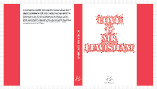
I feel relatively pleased with the way these have come out. Had I had more time I would re shoot the product shots because the more I look at them, the more I just don't like them. I think my favourite is board 3 because it shows the structure of the title being built. My only worry is that I should have perhaps put the posters separate on their own board and the bookmarks on their own board too rather than trying to get them crammed all into one. My reasoning for leaving them as they are is because I feel the enlarged bookmark compliments the detailed smaller shots above.
Development Boards:
After taking these to the crit I realised, like my 3 other briefs I had put too much on each board and the annotation just wasn't needed. The structure of the logo and header/footer lines were fine but I also needed to shrink my text a bit and move it to under the base line so it didn't detract the viewer from the product shots and other images.
Applying designs and products to context:
Here I have tried to show what my in-store posters would look like in the context of existing book stores like Waterstone's.
The posters are meant to focus completely on the centre image with the author and release date coming second in the information hierarchy. I feel that the centre image works appropriately however, should I be asked if I would change anything, I would possibly go back and change the author and release date to be slightly bolder. I feel that they get the message across appropriately and that the image works well. I chose to photograph them against the wooden background to compliment the white and also to keep them consistent to my other product shots.


